- Projects
- Geyer and Valmont Brisbane office
Geyer and Valmont Brisbane office
Geyer and Valmont Brisbane office
Client: Geyer and Valmont
Type: Workplace
Location: Brisbane
Size: 270 m²
Completion: 2024
Design: Geyer
Construction: Valmont
Brief
In many ways, this could have been an ‘impossible’ brief – to envision and bring to life a workspace for ourselves, meeting our own needs and ensuring the same process we follow and quality we ensure for our clients would be applied successfully for us.
Functionally, the brief we’d set as a team was to create a studio space that reflected and supported the variety of our working styles, from design through to construction. The outcome had to offer flexibility, promote connection and demonstrate best-practice design outcomes and importantly, be defined as a workplace that staff could be both proud of and energised by.
Design and subsequent delivery needed to be sympathetic to the building’s heritage, ensuring that the contemporary space we created remained visually connected with the larger built form, and offered true flexibility within.
" The design team was involved in the project from the start to the end and the construction team was fully committed to delivering the vision without diluting design integrity. "
Kate Tuffley, Geyer and Valmont General Manager, QLD.
Meeting a need
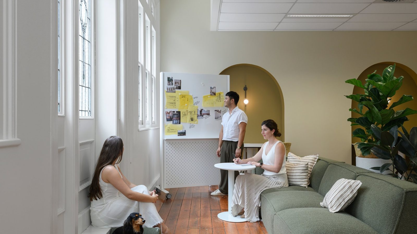
The new space needed to promote collaboration, interaction, teamwork and creativity, fostering greater cohesion between the design and construction processes. Beyond functional requirements, it would need to embody our identity and values, while facilitating diverse types of work.
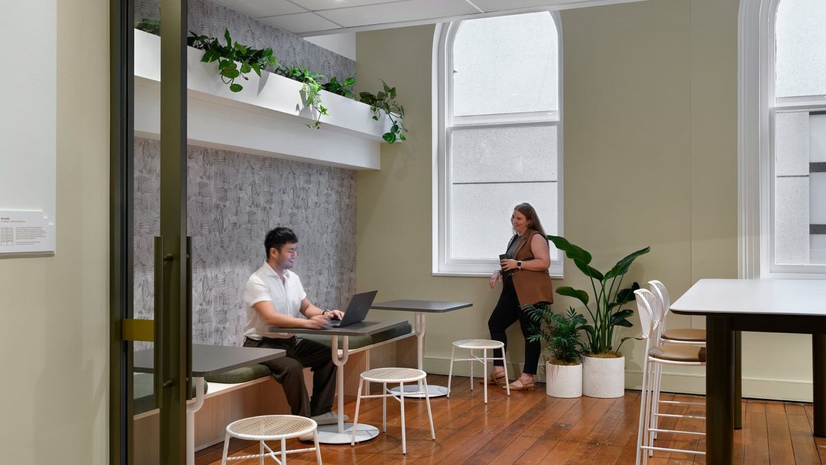
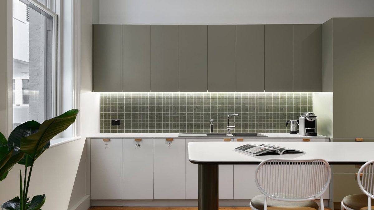
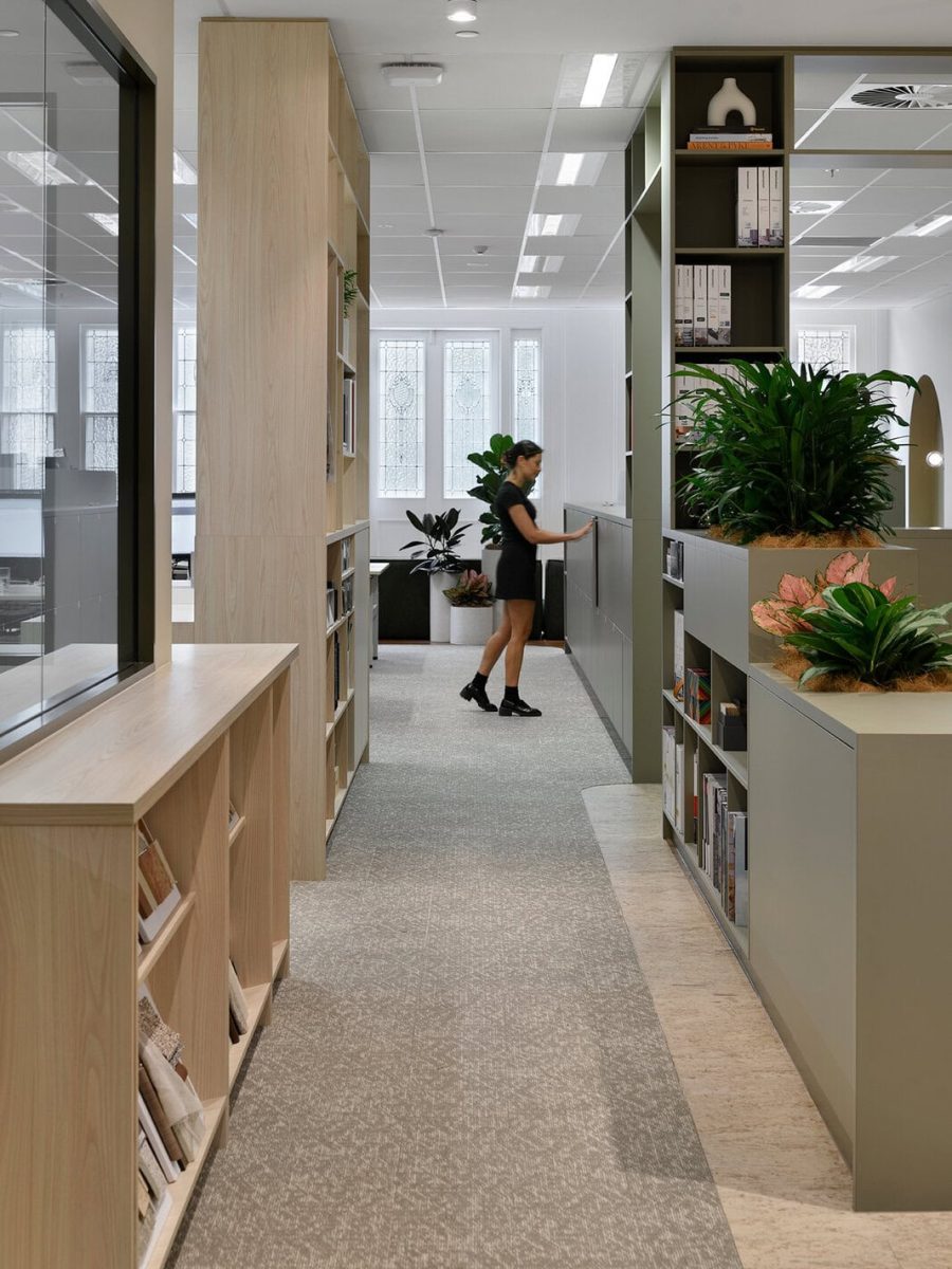
The layout had to provide a range of multipurpose ‘zones’, and use materials and finishes within each that were conducive to different types of activity. Whether we were meeting clients and presenting a solution, planning a design and discussing its delivery, focusing on ‘deep’ work or researching ideas, all had to be accommodated appropriately and be dual-purpose in nature. The presentation lounge needed to double as a client presentation space and a retreat, while the library would serve as a specification lab and collaboration space, and the kitchen would provide the means to host townhall gatherings and informal meetings.
Weaving function and form
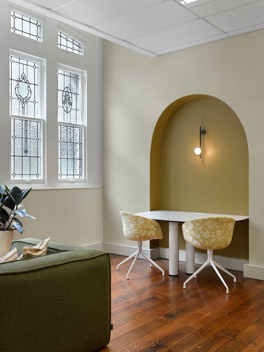
The guiding concept stemmed from the initial construction of the Rowes Building itself in 1885. In time, the ground floor was converted to ‘Rowes Arcade’, and subsequently adorned with decorative mosaic floor tiles, painted ceilings with decorative reveals and feature lighting lining the walls, casting a warm and welcoming ambiance that enticed you to explore the hidden treasures of each boutique.
This notion of layers and sympathetically embedding an ‘old space’ with a ‘new purpose’ was the cornerstone of our overarching narrative ‘Duality Revealed’, where the experience is ‘revealed’ at key moments as you move through the space.
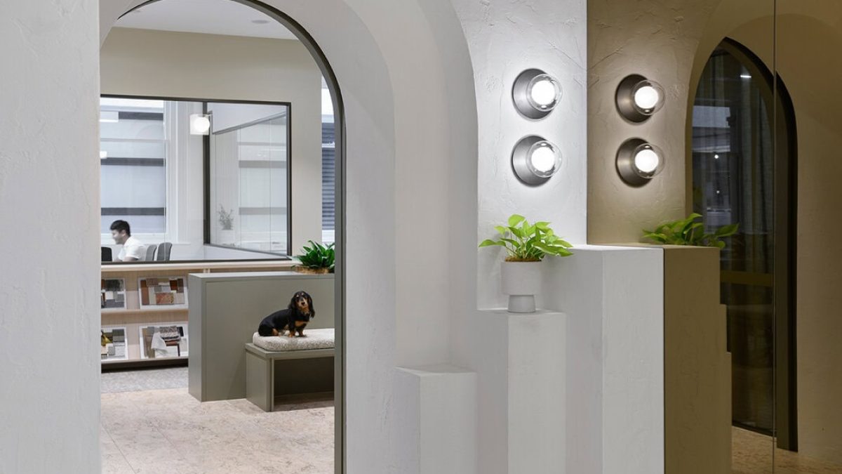
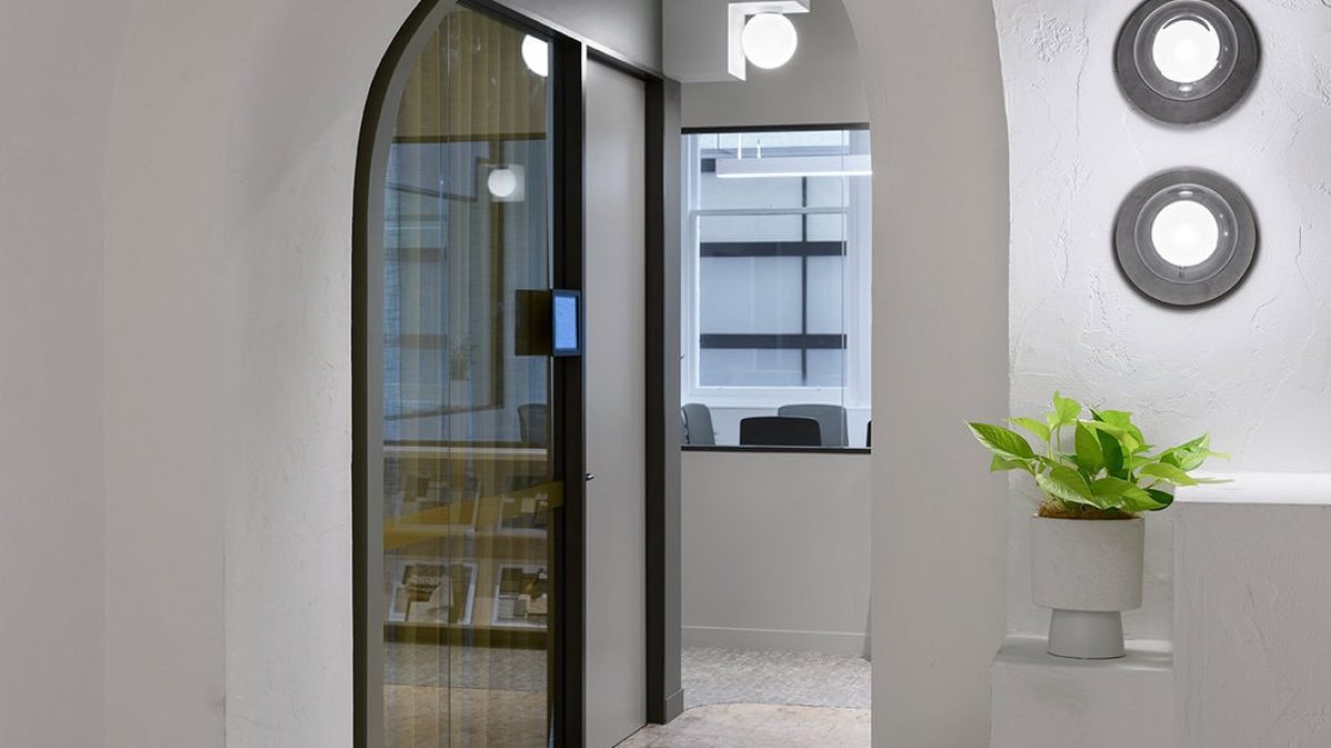
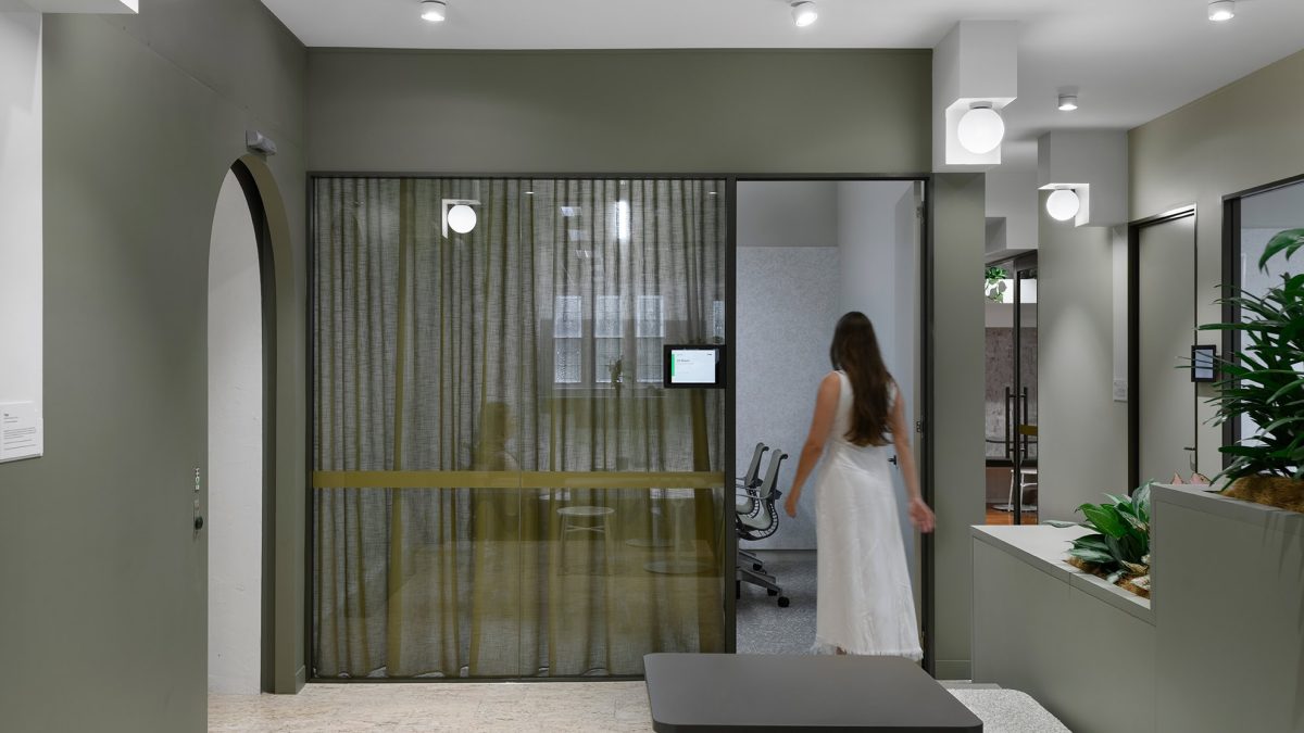
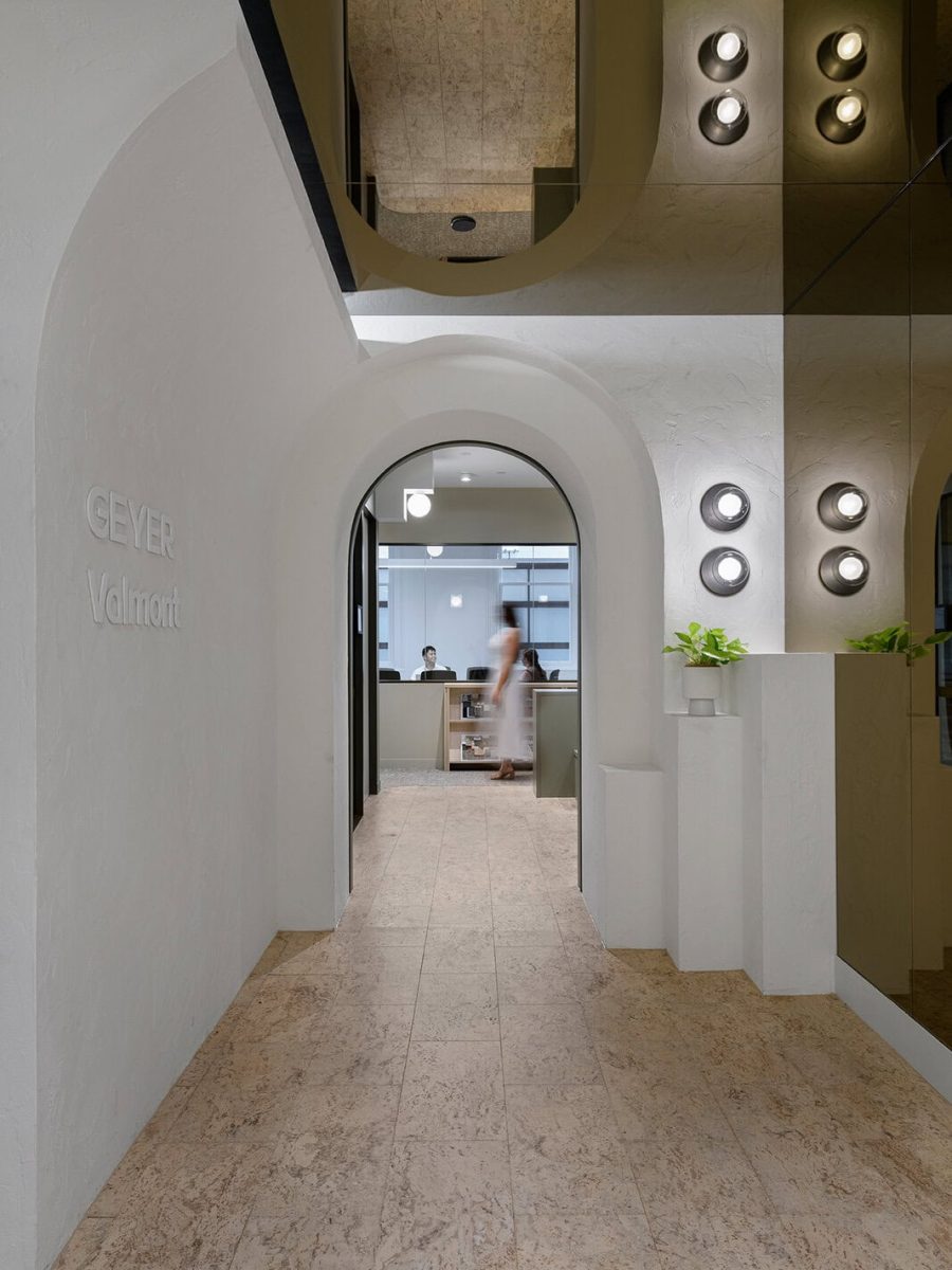
At the main entry, a curved wall turn bulkhead in a textured render wraps the extended threshold, contrasting with a reflective bronze mirror to create a striking and memorable entry experience.
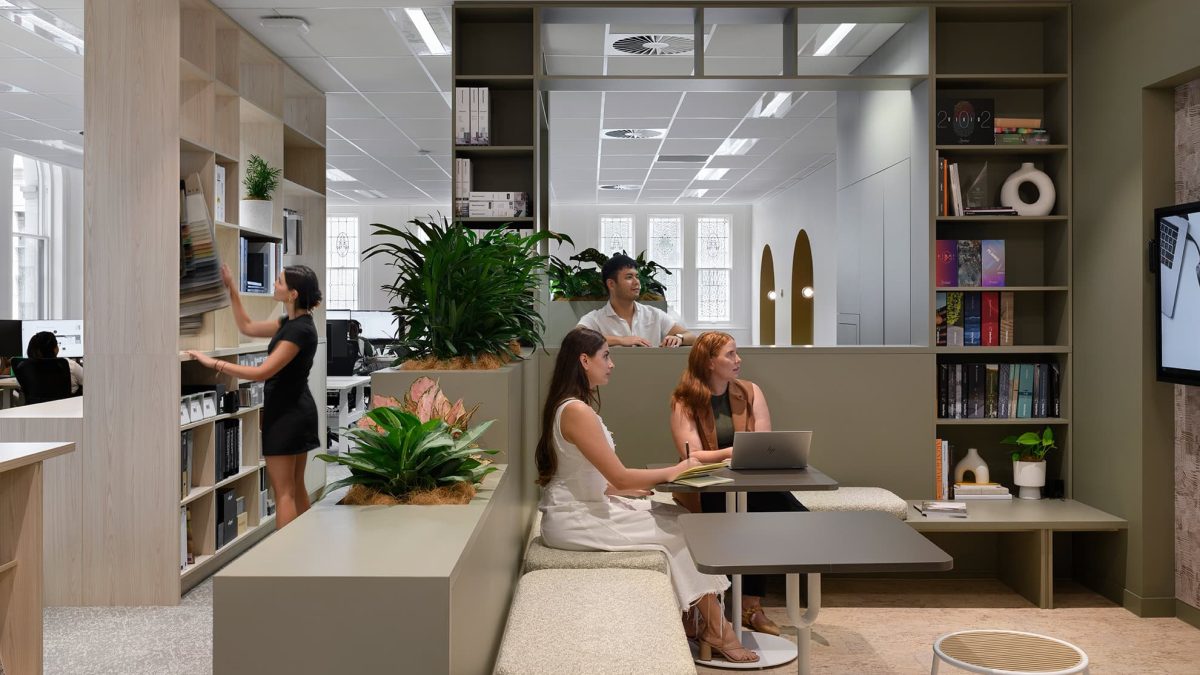
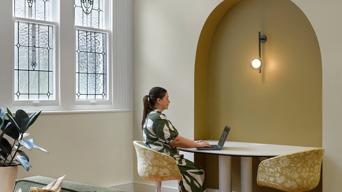
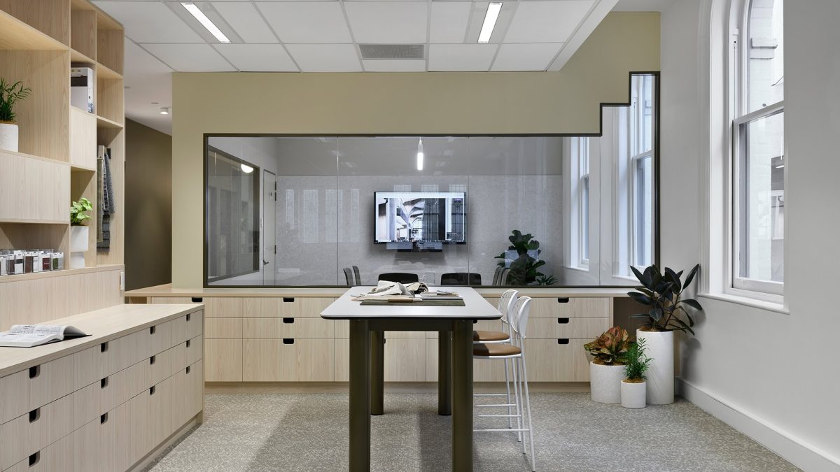
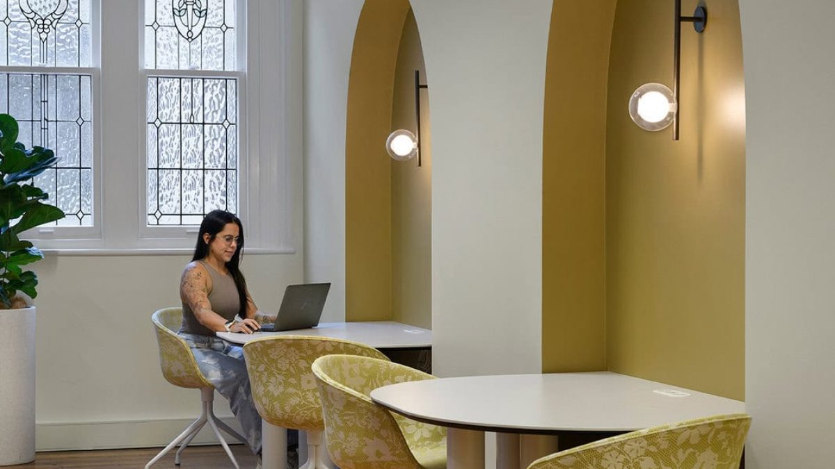
The client presentation lounge features enveloping joinery that creates a corral for congregation with clients, while maintaining lines of sight through the work area and to the heritage stained glass windows beyond.
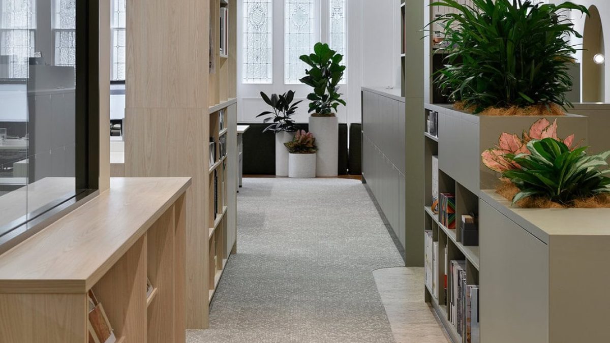
As a design-led business, it was important to situate the all-important design library ‘front and centre’ to showcase the pride and confidence we have in our work, while architectural light boxes with deco-inspired light fittings serve as an integrated wayfinding feature, beginning the reveal of a threshold and a new experience beyond.
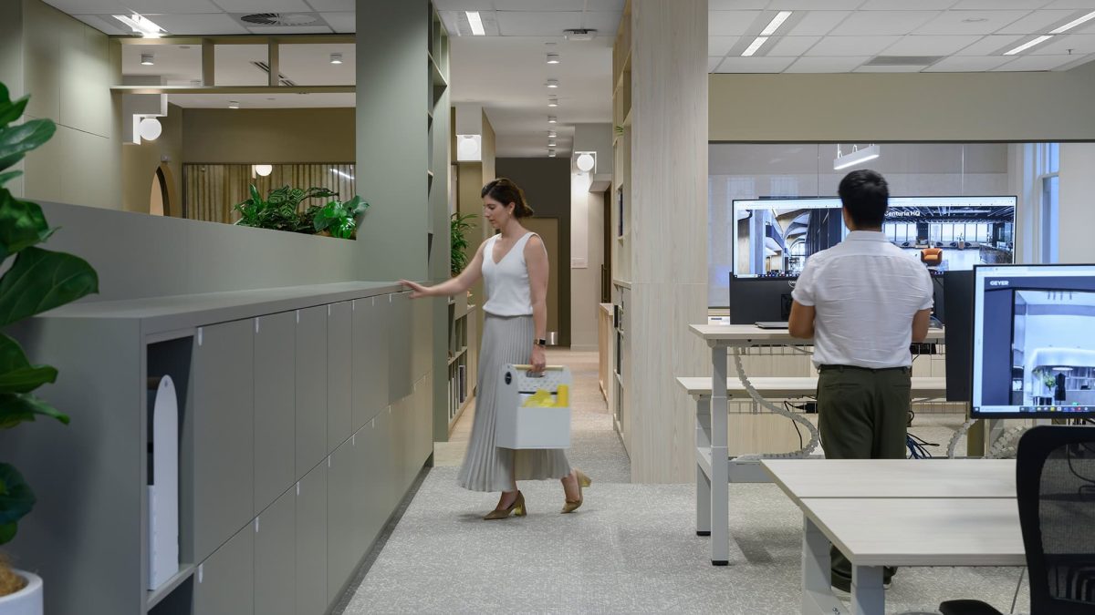
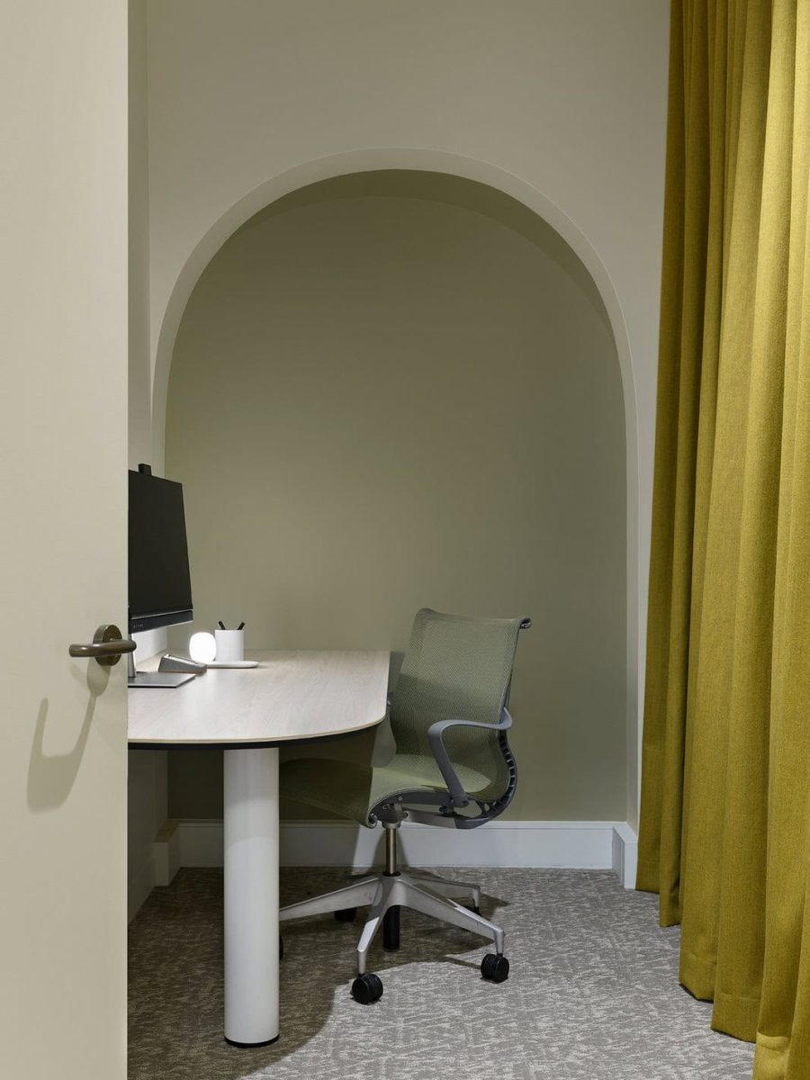
Holistically, the space demonstrates the variety of task-based workstyles that can be employed within a workplace: from height-adjustable process workstations, round-format project-based workstations, short-stay focus rooms and stand-up design lab/finishes library, to short-stay informal meet settings, VC enabled rooms, presentation lounge enabled with touch-screen tech and a workspace-enabled kitchen.
Resolving challenges
The building’s original fabric had to be retained, and any construction and fitout work had to allow for ‘back to base’, i.e., returning the space to its original form.
Any materials and finishes glued, adhered or painted onto original or significant building fabric had to be completely reversible, without damage to original fabric. This was particularly important for the heritage timber floors, so new wall partitions had to be affixed into the ceiling system. Carpet and cork were laid on tactiles, binding the flooring together as a single layer that ‘floats’ on the original timber without the need for a more permanent adhesive or mechanical fixing.
Natural lighting was lower than might be expected for a modern, glass-fronted commercial space. As an important factor in productivity and wellbeing, we had to maximise its availability through a considered layout (such as locating workstations next to the façade to take advantage of natural light) and choosing finishes that could ‘amplify’ it through the space.
Working sustainably
As with every project we design and deliver, all planning and activities were driven by our commitment to a sustainable future, and this project exemplifies this ethos. Furniture and fittings were reused wherever possible, including chairs, the videoconference room TV and Polycom video bar, ceiling tiles and lighting.
We used sustainable cork flooring and carpet tiles, without any chemical adhesive for fixing, while E0 board was sourced for all joinery and workstations. Low VOC paints were used and natural plants were placed throughout to assist with the quality of the internal air, as well as helping users feel in touch with nature.
Reaching a successful outcome
The outcome stands as a testament to the power of our collaborative approach, amply demonstrating that design and build is a synergistic process. In creating this workspace we have met our needs but more importantly, delivered something that inspires and motivates us. We’re proud to showcase what we’ve created, to share it with clients and to provide a space that truly reflects our vision and resonates with the team.
" The outcome is a true testament to the benefit of hand in hand design and construct – being aligned from day one and in constant communication with each other throughout to deliver the project successfully. "
Tamara Rozo, Geyer, Design Studio Leader
Photography: Mindi Cooke.
Other projects
McCullough Robertson
Find out how we can bring your next project to life.
We acknowledge the traditional custodians of the land on which we stand. We pay respect to the Elders past, present and emerging and extend that respect to other First Nations people.
- Valmont | A company of Placewell Group
- Copyright © Valmont Holdings Pty Ltd 2025 | ABN 91 117 035 864
